Who we are


Who is your target?
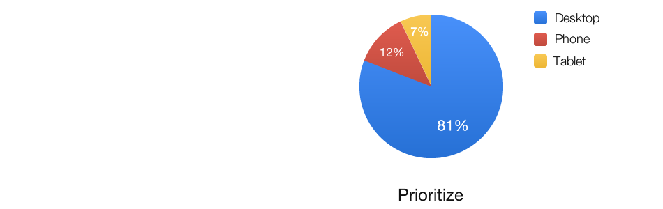
We ran a small survey about which form factors developers support vs prioritize.

If we prioritize a single form factor...

Along comes a new form factor...
Oh hello, mobile!
We ship inferior "mobile experiences"

Along comes a new form factor...
Oh hello... wait, what‽
It's not just desktop & mobile
We have more form factors than ever before, and it's accelerating.

It's just "the web"
It’s not the desktop web, nor the mobile web...


Becoming Device Agnostic
Oh hello, everyone!
The Grand Unified Theory of Devices
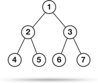
We can assess every device (known and unknown) in the same way:


Devices vs. Constraint
| Network | Compute | Render | Screen | |
|---|---|---|---|---|
| Desktop | Good | Good | Good | Large |
| Mobile | Bad | OK | Bad | Small |
| TV | Good | Bad | Bad | Large |
| Console | Bad | OK | Bad | Small |
| New Device | ? | ? | ? | ? |
Devices vs. Constraint
| Network | Compute | Render | Screen | |
|---|---|---|---|---|
| Desktop | Maybe | Maybe | Maybe | Maybe |
| Mobile | Maybe | Maybe | Maybe | Maybe |
| TV | Maybe | Maybe | Maybe | Maybe |
| Console | Maybe | Maybe | Maybe | Maybe |
| New Device | ? | ? | ? | ? |
Know your Chrome DevTools!
- Check out The Breakpoint
- Watch Chrome DevTools Revolutions 2013
- Hit the DevTools docs

Solving for Network
Page Load Time (PLT)


Source: Strangeloop

Reduce your Requests
- Every request has a latency, bandwidth and financial cost
- Obsolete your requests: do you need that file?
- Reduce your requests: concatenate and minify
Reduce Image Overhead
- 60% of web traffic is images[1]
- Change formats: WebP saved the Chrome Web Store several TB of transfer[2]
- Request images at the size you need - let the server do the work!
- Do you even need images? SVG may be better a better match!
Sources: [1] HTTP Archive, [2] Chromium Blog
mod_pagespeed
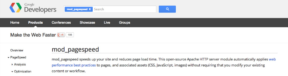
- Automatically speeds up your site and reduces page load time
- Available for Apache and in beta for nginx
PageSpeed Insights

- Pop your site in, hit "Analyze"
- Get free network performance advice!
Resource Timing API
- High-fidelity timing information per resources
- Track performance and provide an adaptive experience
Solving for Compute
Jank
- Chrome synchronizes to the refresh rate of the device
- At 60Hz all of Chrome's work has ~16.7ms to complete (frame budget)
- Users notice missed frames and they don't like it!
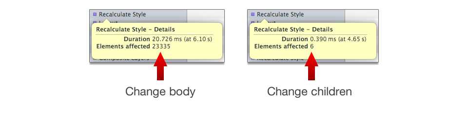
Limit Style Recalculations
- Limit style changes to the DOM
- Don't change the
bodywhen you should change child elements directly
Avoid Layout Thrashing
var target = document.getElementById('target');

// set each element to have the same width as the target
for (var e = 0; e < elements.length; e++)
  elements[e].style.width = target.offsetWidth + 'px';
- We get
offsetWidth(causes a layout) - We set
style.width(invalidates the layout) - We repeat that process
Avoid Layout Thrashing
var target = document.getElementById('target');

// get the width and cache it
var targetWidth = target.offsetWidth;

// now set each element's width with the cached value
for (var e = 0; e < elements.length; e++)
  elements[e].style.width = targetWidth + 'px';
Remove Unnecessary JavaScript
- Don't do in JS that which can be done in CSS: animations & transitions
position:fixedis your friendposition:stickyis upcoming- Keep your event listener code to a minimum, they can run several times per frame
Solving for Render
Reduce Image Overhead... Again!
Reduce Paint Cost
- When you scroll or interact parts of the page get painted
- Painting is expensive
- Keep painting to a minimum

First, reduce the size...
Then, reduce the complexity...
Solving for Your Users
The same content and functionality
- You are subject to many constraints
- Don’t pass them on to users
- You should not offer reduced functionality

Users come to you for content
- Big screens = room for content
- That doesn't work for small screens
- Give them the same content, but refactor for the constraint

Suggestions
Assign a Sheriff
- Clarify your constraints before you start
- Set limits (number of requests, GCs, paint time, layout, style calculations)
- Track it during the lifetime of the project
- Don't ship until you hit your targets

Check out jankfree.org!
http://jankfree.org/ - some must-see resources
Also watch Jank Free: Chrome Rendering Performance
Conclusion
Conclusion
- It’s not about devices, it’s about content
- Every device is likely to have at least one constraint
- Let the browser do the work
- Above all, deliver the content to your users quickly
Thank You!
@aerotwist | google.com/+aerotwist
@beverloo | peter.sh/+